A lot of plant managers are dealing with the same frustrating scene right now. The machine is mechanically fine, the sensors are healthy, the PLC is running, and production still stalls because an operator can't quickly tell which mode the station is in, which alarm matters, or what the next safe action should be. In mixed lines with semi-automatic cells, manual stations, and newer touch panels sitting next to older HMIs, that confusion turns into downtime, scrap, retraining, and quality risk fast.
That's why human-machine interface design matters more than most equipment buyers expect. The screen isn't decoration. It's the working surface between your people and your process. If you provide manufacturing solutions to optimize production and services, HMI choices directly affect how reliably operators run equipment, recover from faults, and maintain throughput under real shift conditions.
Table of Contents
- Why HMI Design Is Your Next Competitive Advantage
- The Foundations of User-Centric Industrial HMI Design
- Critical HMI Strategies for Safety and GMP Compliance
- Solving Real-World Challenges with Smart HMI UX Patterns
- Your HMI Implementation Roadmap from Concept to Commissioning
- Measuring HMI Impact and Partnering for Success
Why HMI Design Is Your Next Competitive Advantage
A weak HMI rarely shows up on a capital request as the main risk. It usually appears later, after startup, when operators start calling maintenance for problems that aren't really maintenance problems. The machine works. The interface doesn't support fast decisions.
That gap hits production KPIs directly. In industrial and medical-device manufacturing environments, well-designed HMIs can reduce operator monitoring and reaction times by up to 30 to 40% compared with legacy pushbutton or hard-wired control panels because one graphical screen can combine status, alarms, and controls in a single view, according to Lascar Electronics' explanation of HMI performance benefits. Faster recognition means faster response, and faster response usually means less waiting, less wandering, and fewer avoidable stops.
What plant managers usually see first
The first signs are practical, not theoretical:
- Longer fault recovery: Operators stop and ask for help because the machine state isn't obvious.
- Inconsistent shifts: One team runs the line smoothly, another loses time on the same station.
- Training drag: New operators memorize button sequences instead of understanding the process.
- Quality exposure: Mode errors, missed prompts, or unclear confirmations create avoidable deviations.
Practical rule: If operators need tribal knowledge to run a station confidently, the HMI is carrying too much hidden complexity.
A strong HMI turns that around by making the equipment legible. The operator should know three things at a glance: what the machine is doing, what it needs next, and what's blocking production. When those answers are visible without hunting through screens, the line gets easier to run and easier to scale.
That's one reason HMI design now belongs in broader smart manufacturing strategies for a competitive future. The interface determines whether the data and automation you've already paid for improve operations on the floor.
The Foundations of User-Centric Industrial HMI Design
Good industrial HMI design has more in common with a well-laid-out car dashboard than with a flashy consumer app. You don't want novelty. You want instant recognition, predictable controls, and clear feedback under pressure.
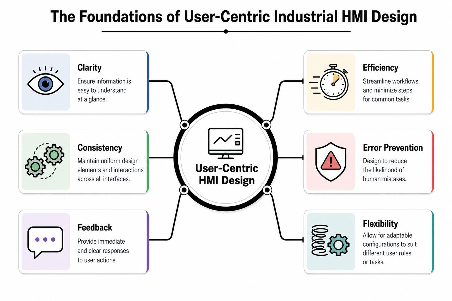
Start with the operator's actual job
Operators don't use screens the way engineers present systems in design reviews. They use them while loading parts, watching a conveyor, clearing faults, verifying counts, and answering questions from quality or maintenance. That's why the first design question isn't “What can this HMI show?” It's “What does this person need to do in the next few seconds?”
A practical screen hierarchy usually works best:
| Screen level | What it should do | What to avoid |
|---|---|---|
| Overview | Show machine state, line status, major interlocks, active alarms | Dense diagnostic detail |
| Operation | Support normal run tasks like start, stop, reset, recipe selection | Hidden key controls |
| Detail | Expose device status, timers, fault causes, sensor states | Making operators dig here for routine work |
| Maintenance | Help technicians troubleshoot safely | Letting production users alter critical settings casually |
That structure gives people orientation. It also lowers mental load because they don't have to guess where information lives.
Use color and layout with discipline
Most poor HMIs overuse color. Every pump is bright. Every box is outlined. Half the screen flashes. Operators stop noticing what matters because everything competes for attention.
A widely cited human-factors study found that a standardized color syntax, using red for stop or critical alarms, green for normal operation, and yellow for warnings, improved correct alarm recognition by 30 to 40% compared with non-standardized interfaces. The same source notes that 68% of operator usability issues were linked to inconsistent layout and color use across screens, as summarized by Control Engineering on HMI design principles.
The practical takeaway is simple:
- Keep backgrounds neutral: Gray-scale backgrounds reduce visual fatigue and make alerts stand out.
- Reserve bright color for abnormal states: Don't spend attention on decoration.
- Place repeat elements in repeat locations: Nav bars, alarm banners, machine state, and key actions should stay put.
- Use one style guide across the site: This matters even more when you're tying new stations into broader automation control systems.
A consistent layout saves more time than a pretty screen ever will.
Build feedback into every action
Every control needs an obvious response. If an operator presses Start, the screen should confirm the command and show the machine transition. If a parameter change is rejected, the HMI should say why. If a safety condition blocks a reset, the operator should see the blocking condition without opening three more pages.
Three feedback habits work well on factory floors:
Immediate state change
Buttons should reflect pressed, accepted, unavailable, or blocked states clearly.Context near the action
Don't bury the reason for a failed command in a separate alarm list.Clear ownership
If maintenance login is required, say that directly instead of showing a dead-looking control.
Human-machine interface design works when operators don't have to interpret the interface itself. They should spend their attention on the process, not on figuring out the screen.
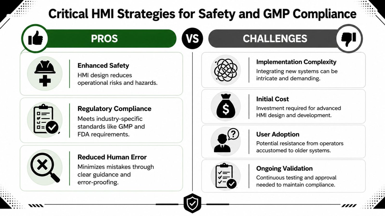
Critical HMI Strategies for Safety and GMP Compliance
A compliant HMI isn't just one that logs data. It's one that helps the operator act correctly when the process moves out of normal conditions. That distinction matters in any plant, and it matters even more in regulated manufacturing where every alarm acknowledgment, override, and parameter change may need to stand up to review later.
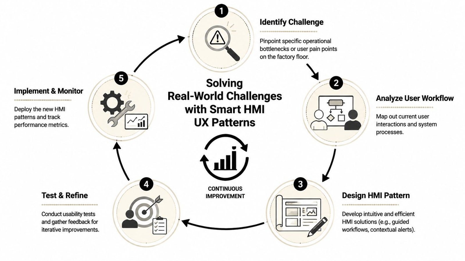
A strong visual summary helps teams align on priorities before they get into detailed screen logic.
Alarm management is a workflow, not a light show
Plants get into trouble when alarms are treated like generic notifications. If every event is loud, red, and urgent, the operator learns to click through noise. That's how genuine safety and process risks get missed.
Best-practice HMI frameworks recommend multi-tier alarm strategies because unmanaged systems can generate hundreds of alarms per hour, leading to operator alarm fatigue and a 20 to 30% increase in missed critical events, according to Radonix's review of HMI alarm design. The same source highlights the value of timestamped logging for acknowledgments and parameter changes in regulated environments.
In practice, that means separating events like this:
| Alarm type | Operator experience | Design approach |
|---|---|---|
| Critical | Immediate action required | Flashing indicator, audible alert, direct focus to affected screen |
| High priority | Prompt action needed, process at risk | Prominent list placement, clear cause and response guidance |
| Advisory | Awareness needed, not immediate danger | Visible but quieter presentation |
| Information | Logged for history or support | No visual overload on main screens |
The point isn't more alarms. It's better discrimination.
Later-stage teams often benefit from seeing one example of how structured alarm communication is taught in practice.
Compliance has to live inside the interface
In GMP-aware environments, the HMI often becomes part of the evidence trail. If a user changes a process value, bypasses a step, or acknowledges a critical event, the system should record who did it, when they did it, and what changed. Without that traceability, investigations get slow and conclusions get weak.
That's where compliance-driven HMI design usually needs more discipline:
- Role-based access: Operators, maintenance, engineering, and quality shouldn't all see the same controls.
- Action traceability: Critical actions need timestamps and user attribution.
- Message clarity: Alarm text has to describe the issue in plant language, not programmer shorthand.
- Review readiness: Logs should support GMP-oriented investigation and deviation review, which is central to understanding GMP in manufacturing.
The safest screen is the one that tells the operator what happened, what changed, and what to do next without forcing interpretation.
Where safety design usually fails
The most common failures are ordinary. Alarm text says “Fault 27” instead of describing the blocked condition. A reset button stays active when the machine is in the wrong mode. A warning banner appears, but the relevant sensor status is buried on a maintenance page. None of those issues look severe in a conference room. All of them create risk on a live line.
A stronger approach uses layered guidance. Show the fault. Show the affected zone. Show the first safe recovery step. If the user needs maintenance support, say that directly. If the process needs supervisor approval, say that too.
That's the difference between an HMI that merely reports problems and one that helps control them.
Solving Real-World Challenges with Smart HMI UX Patterns
Most factories don't get to start fresh. They inherit old panels, partial upgrades, line expansions, and operator habits built over years. That's why human-machine interface design has to work in practical settings, not just in a clean-sheet standard.
A major weakness in many plants shows up during transitions. A 2023 survey indicated that 47% of downtime incidents in semi-automated lines were traced to operator confusion during mode changes or fault recovery, yet only 19% of companies reported having formal HMI design guidelines for those workflows, according to Butler Technologies' discussion of HMI design gaps. That matches what many operations teams already suspect. The difficult part isn't starting a machine. It's recovering cleanly when normal flow breaks.
Mode changes need to be unmistakable
Semi-automatic equipment often supports states like Setup, Manual, Auto, Maintenance, Hold, and Fault Recovery. If the active mode is subtle or hidden, operators make the wrong assumption and the wrong move follows.
The best pattern is blunt visibility:
- Persistent mode banner: Keep current mode at the top of every relevant screen.
- State-specific controls: Show only the actions that make sense in the active mode.
- Entry conditions: Before a mode change completes, display unmet interlocks clearly.
- Exit consequences: If moving into Setup disables automatic cycling, tell the user upfront.
That reduces cognitive switching. It also cuts down on arguments between operations and maintenance about whether the machine “changed by itself.”
Guided recovery beats operator guesswork
Fault recovery is where average HMIs fall apart. They tell users something is wrong, but they don't structure the path back to production. Operators then improvise, call for help, or reset repeatedly.
A better UX pattern is the guided recovery flow. Not a giant wizard for everything, but a focused sequence for the faults that stop you most often.
For example, a recovery screen can do four things well:
- Identify the blocked subsystem in plain language.
- Show live status for the interlocks that matter.
- Present the next approved recovery step.
- Confirm when the machine is ready to resume.
If fault recovery depends on memory, your line is one staffing change away from more downtime.
This is especially important when one operator moves between manual tasks and automated stations. The HMI has to bridge that handoff cleanly, not assume the operator remembers every branch condition.
Legacy and modern HMIs need a shared mental model
Small and mid-sized manufacturers rarely replace every interface at once. One cell gets a modern touchscreen. The next station still runs on older hardware. That doesn't have to create chaos, but it will if each machine speaks a different visual language.
A practical retrofit strategy keeps consistency in the parts operators rely on most:
| Shared element | Why it matters across generations |
|---|---|
| Alarm colors | Preserves urgency recognition |
| Common terminology | Prevents “same thing, different name” confusion |
| Navigation logic | Makes it easier to move between stations |
| Status placement | Reduces scan time and searching |
| Button naming | Limits training drift |
You don't need identical hardware to create a coherent experience. You need consistent symbols, words, priorities, and workflow logic. When upgrades happen gradually, that design discipline matters more than cosmetic modernization.
Your HMI Implementation Roadmap from Concept to Commissioning
Most HMI projects go wrong early. Not because the software team can't build screens, but because nobody agreed on operator tasks, alarm philosophy, screen ownership, or validation needs before development began.
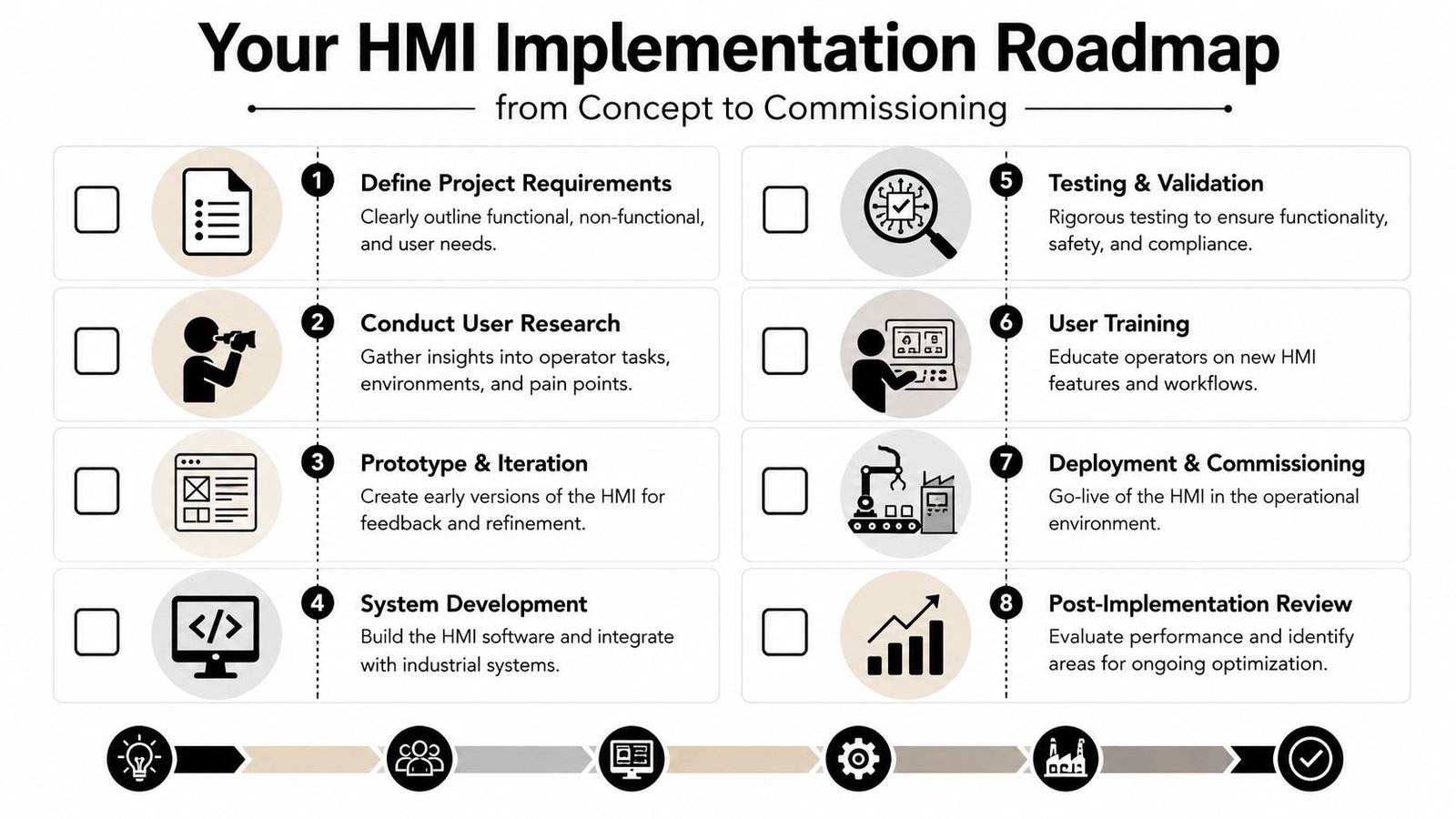
Define success before anyone draws screens
Start with operations, quality, maintenance, and controls in the same discussion. The point is to define what the HMI must help people do, not just what the machine can display.
A practical kickoff checklist looks like this:
- Production goals: Which losses are you trying to reduce, slow changeovers, extended fault recovery, scrap, or operator dependence?
- User groups: Who uses the screen during production, setup, maintenance, supervision, and quality review?
- Critical workflows: Which actions must be fast, foolproof, and traceable?
- Compliance needs: Which actions require access control, acknowledgment, or logging?
- Legacy constraints: What existing screen habits or panel limitations can't be ignored?
If that work is skipped, the interface usually becomes a mirror of PLC tags instead of a tool for operators.
Prototype with operations, not just engineering
Wireframes and mockups save rework because they expose bad assumptions before code is written. This doesn't require polished graphics. Even simple screen maps can reveal missing navigation, poor grouping, or overloaded pages.
Review prototypes using shift-floor questions:
| Review question | Why it matters |
|---|---|
| Can an operator tell machine state in seconds? | Measures first-glance clarity |
| Can they reach common actions quickly? | Prevents buried controls |
| Can they understand why a command failed? | Reduces calls for support |
| Can maintenance troubleshoot without exposing production to risky controls? | Supports separation of duties |
One useful habit is to walk the prototype through normal production, startup, jam clearing, mode change, and fault recovery. If the design only looks clean during normal run, it isn't ready.
Commission for the real shift, not the demo
Factory acceptance and site acceptance should challenge the HMI under conditions that resemble actual use. Bright conference-room demos don't tell you how the screen behaves when an operator is wearing gloves, the line is noisy, and a fault appears during a rushed changeover.
The strongest implementation sequence usually follows these steps:
Approve functional requirements
Lock down user roles, alarm behaviors, screen hierarchy, and data points.Build and integrate
Tie HMI behavior to PLC logic, device states, and line interlocks.Test abnormal conditions
Verify blocked commands, alarm priority, recovery flows, and access permissions.Train by role
Operators, maintenance, and supervisors need role-specific training, not one generic overview.Support early production
The first production period often reveals wording, timing, and navigation issues worth correcting fast.
Commissioning should prove that operators can recover from trouble safely, not just that the screen turns on.
A good HMI project finishes only when the interface works for the people running the process.
Measuring HMI Impact and Partnering for Success
A better HMI should show up in plant performance, not just in operator comments. If you want to know whether the redesign worked, track how quickly crews identify faults, how consistently they recover from stops, how often they need engineering help, and how cleanly they hold process discipline across shifts. Those are operational results, not aesthetic opinions.
The business case is getting stronger across manufacturing. The global HMI market reached about USD 5.2 billion in 2023 and is projected to reach USD 7.7 billion by 2028, with a CAGR of 8.2%, driven by industrial automation and smart manufacturing, according to MarketsandMarkets' HMI market outlook. That growth reflects a simple reality. Manufacturers are treating the interface as a performance tool because it directly affects efficiency on the floor.
For plant managers, the useful question isn't whether HMI design matters. It's where poor HMI design is already costing time, quality, and attention. In most facilities, the answer shows up in recurring faults, inconsistent operation between shifts, slow onboarding, and avoidable support calls.
Human-machine interface design pays off when it fits the actual line. Semi-automatic workflows, legacy hardware, GMP expectations, operator turnover, and budget limits all shape the right solution. The best results come from partners who understand those trade-offs and can translate them into equipment that's easier to run, easier to support, and easier to scale.
If you're planning a new machine, upgrading a semi-automatic cell, or trying to standardize operator experience across mixed equipment, System Engineering & Automation can help you turn HMI decisions into practical production gains. Their team delivers cost-effective manufacturing solutions that optimize production and services, from early concepts and controls integration to commissioning and ongoing support, with a strong fit for manufacturers balancing usability, compliance, and ROI.